Designing a cover is probably one of the most fun parts of being part of the development process with a small press publishing company.
I actually have some say so in the cover design. Ultimately, Frank, the owner of Phenomenal One Press has the final say, but he doesn’t make that decision alone. We actually poll teens throughout the variations of design. Is that an exact science? Not always, but it helps us gage whether someone would pick the book up when it’s smashed in there with tons of others.
COLORS
Since Bandits takes place on a planet of a million islands, the colors we chose for the background reflected the world built within the novel. We still wanted the colors to be dynamic enough to catch a potential reader’s eye. The catch is, everyone is different.
Some of the samples we sent out to be reviewed, teens wanted brighter colors or more sinister combinations. However, the colors we chose gained the highest number of votes. Not an exact science, but what we found that works.
CHARACTERS
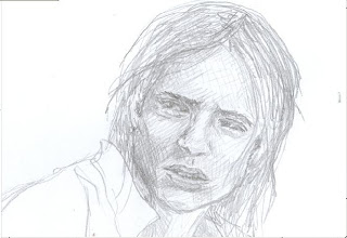
We decided to show the likeness of the three main characters in BANDITS. Since the characters are diverse in race and gender, we thought it would be cool to put all of them on the cover. Daniel, the main character is captured on the front cover. Faulk and Jade, his cohorts in the search for the stolen treasure, are captured on the back cover.
We found an awesome company with an artist that sketched each character. Stay tuned for a sneak peek of Faulk and Jade.
With the characters, we looked through hundreds of pictures with different poses and characteristics. We captured a few of each character and noted what we liked and didn’t like about them. Then we polled some teens to get their opinion of the attractiveness of each character and the pose.
Once we tallied the responses, the publisher made the final decision and the artist sketched the characters for us.
WHY IT MATTERS?
Covers are the last place you want to go cheap. Typically publishers spend anywhere between $700 to $5000 for a good cover, and that’s what Indie publishers have to compete with when trying to make their product attractive to readers. Let’s face it, if you don’t have a cover that will at least invoke someone to pick it up – then selling the book becomes even more difficult.
SO – what do you think?
What do you think of this sketch of Daniel? Do you want to know why he has that expression on his face? Do you want to know….his story?

2 comments:
That is so exciting! Good luck with your cover! I bet it's great!
It is...one of my favorite parts of writing.
Post a Comment